Scatter plots are highly important charts in data science. If you are good at creating good scatter plots then you can discover important insights from your data.
In this article, we will use Bokeh to create scatter plots using a sales dataset. Bokeh is a modern, feature-rich, and easy-to-use Python library for data visualization.
I urge you to run the code alongside this tutorial and I am sure you will become a master at making scatter plots with Bokeh.
Import a sales dataset as a Pandas dataframe
Let’s import a sales dataset that we will use to create scatter plots using Bokeh and Python. You can download the dataset from Kaggle and keep the CSV file in your working directory.
import pandas as pd
# read data from CSV file
df = pd.read_csv("department_store_dataset.csv")
df.head()
| index | Seller | Department | Revenue | Revenue_Goal | Margin | Margin_Goal | Date | Sales_Quantity | Customers |
|---|---|---|---|---|---|---|---|---|---|
| 0 | Letícia Nascimento | Eletrônicos | 6139.41 | 1857.66 | 0.14 | 0.18 | 2017-01-01 | 50 | 213 |
| 1 | Ana Sousa | Eletrônicos | 7044.96 | 5236.01 | 0.3 | 0.17 | 2017-01-01 | 52 | 256 |
| 2 | Gustavo Martins | Eletrônicos | 4109.85 | 1882.47 | 0.14 | 0.2 | 2017-01-01 | 33 | 189 |
| 3 | Beatriz Santos | Vestuário | 315.3 | 2069.08 | 0.2 | 0.17 | 2017-01-01 | 2 | 6 |
| 4 | Camila Lima | Vestuário | 1672.33 | 3587.07 | 0.24 | 0.14 | 2017-01-01 | 12 | 50 |
Data description
- Seller: Salesperson’s name.
- Department: Department to which the salesperson belongs.
- Revenue: Revenue generated by the salesperson on the respective day.
- Revenue Goal: Salesperson’s revenue goal for the respective day.
- Margin: Gross profit margin achieved by the salesperson on the respective day.
- Margin Goal: Salesperson’s profit margin goal for the respective day.
- Date: Date on which the sales were recorded.
- Sales Quantity: Number of customers who actually made a purchase.
- Customers: Total number of customers served.
Bokeh scatter plot from dataframe
Let’s create a simple scatter plot from a pandas dataframe using Bokeh. I will create a plot between ‘Revenue’ and ‘Sales_Quantity’ metrics.
First import some important functions from Bokeh.
from bokeh.plotting import figure, show
from bokeh.io import output_notebook
This line below is needed for the plot to appear in a Jupyter Notebook or Google Colab.
output_notebook()
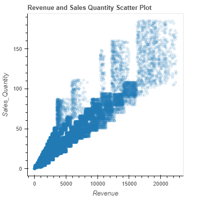
p = figure()

# add a scatter renderer
p.circle(df['Revenue'], df['Sales_Quantity'])

# display the scatter chart
show(p)

Bokeh generates interactive visuals, permitting zooming in, zooming out, and other features, which can be quite useful while exploring patterns in data.
Change Bokeh scatter plot size
We can easily alter the width and height of the chart canvas by using the figure() method.
# change chart size
p = figure(width=400, height=400)

p.circle(df['Revenue'], df['Sales_Quantity'])

# display the scatter chart
show(p)

Add Bokeh scatter plot title and axes labels
As you can see, we don’t have any title for the scatter plot and there are no axes labels as well. So, let’s add these elements to our scatter chart.
# add plot title and axis labels
p = figure(title = "Revenue and Sales Quantity Scatter Plot",
           x_axis_label = 'Revenue',
           y_axis_label = 'Sales_Quantity',
           width=400,
           height=400)

p.circle(df['Revenue'], df['Sales_Quantity'])

show(p)

Change marker size and transparency of Bokeh scatter plot
The size attribute specifies the size of the markers and alpha controls the transparency of the markers.
p = figure(title = "Revenue and Sales Quantity Scatter Plot",
           x_axis_label = 'Revenue',
           y_axis_label = 'Sales_Quantity',
           width=400,
           height=400)

p.circle(df['Revenue'], df['Sales_Quantity'], size = 5, alpha=0.1)

show(p)

Hide grid lines of Bokeh scatter plot
If you want to hide the gridlines in a Bokeh plot, you can do so by setting the grid grid_line_color property to None.
p = figure(title = "Revenue and Sales Quantity Scatter Plot",
           x_axis_label = 'Revenue',
           y_axis_label = 'Sales_Quantity',
           width=400,
           height=400)

# hide grid lines
p.xgrid.grid_line_color = None
p.ygrid.grid_line_color = None

p.circle(df['Revenue'], df['Sales_Quantity'], size = 5, alpha=0.1)

show(p)
In the code above, p.xgrid.grid_line_color = None hides the gridlines of the x-axis and p.ygrid.grid_line_color = None hides the gridlines of the y-axis.
This will leave you with a clean, gridless plot that can sometimes be more aesthetically pleasing or less cluttered for presentations.
Change Bokeh scatter plot background color
Yes, you can certainly change the background color of a Bokeh plot. The background_fill_color property of the figure object allows you to do this.
p = figure(title = "Revenue and Sales Quantity Scatter Plot",
           x_axis_label = 'Revenue',
           y_axis_label = 'Sales_Quantity',
           width=400,
           height=400)

p.xgrid.grid_line_color = None
p.ygrid.grid_line_color = None

# change chart background color
p.background_fill_color = "#DCF598"

p.circle(df['Revenue'], df['Sales_Quantity'], size = 5, alpha=0.1)

show(p)

In the above code, p.background_fill_color = "#DCF598" changes the background color of the plot. You can replace it with any color you want using its hexadecimal color code.
Bokeh scatter plot color by category
In our dataset, we have a categorical column called ‘Department’. Let’s try to color the markers in the scatter plot based on this categorical feature.
To color the markers in the scatter plot by the Department categorical feature, you’ll first need to map the unique categories of the Department column to different colors. This can be achieved using the factor_cmap method in Bokeh.
However, bear in mind that Bokeh doesn’t support direct coloring based on dataframe columns. So we will first convert the categorical column (‘Department’ in this case) into an integer column and then use a colormap to map those integers to colors.
from bokeh.transform import factor_cmap
from bokeh.palettes import RdYlGn11
p = figure(title = "Revenue and Sales Quantity Scatter Plot",
           x_axis_label = 'Revenue',
           y_axis_label = 'Sales_Quantity')

p.background_fill_color = "black"

# Get the unique departments and assign a color to each department
departments = df['Department'].unique().tolist()
color_map = factor_cmap(field_name='Department', palette=RdYlGn11, factors=departments)

p.circle('Revenue', 'Sales_Quantity', alpha=0.7, color=color_map, legend_field='Department', source = df)

show(p)
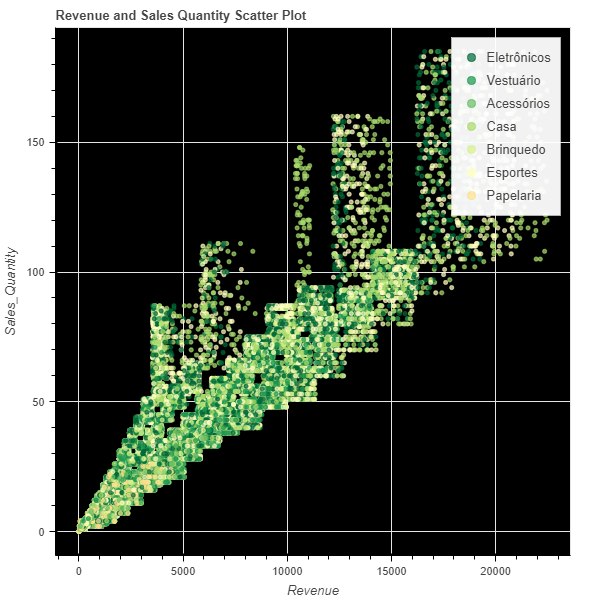
In the above Python code:
- We first extract the unique values from our ‘Department’ column and create a list out of it named ‘departments’.
- We then create a colormap ‘color_map’ using the
factor_cmapfunction. We specify the field name (i.e., our ‘Department’ column), the palette of colors to use (in this case, RdYlGn11), and our factors (which are our unique departments). - When creating the circle scatter graph, we add the color parameter and set it to our colormap. We also add legend_field=’Department’ to indicate the colors in the legend, and also specify the source of our data.
- These changes will color the scatter plot markers by the Department feature and also add a legend to our scatter chart.
Change position of legend in Bokeh scatter plot
In the scatter chart above, we can see that the legend is positioned at the top left corner of the chart canvas. If we can move the legend to the bottom right corner then the chart will look more tidy. Let’s do it.
p = figure(title = "Revenue and Sales Quantity Scatter Plot",
           x_axis_label = 'Revenue',
           y_axis_label = 'Sales_Quantity')

p.background_fill_color = "black"

# Get the unique departments and assign a color to each department
departments = df['Department'].unique().tolist()
color_map = factor_cmap(field_name='Department', palette=RdYlGn11, factors=departments)

p.circle('Revenue', 'Sales_Quantity', alpha=0.7, color=color_map, legend_field='Department', source = df)

# Move the legend to the bottom right corner
p.legend.location = "bottom_right"

show(p)
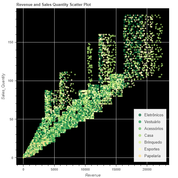
Simply using p.legend.location = "bottom_right" changes the location of the legend to the bottom right corner of the plot. Bokeh supports other legend positions such as “top_left”, “top_right”, “bottom_left”, “bottom_right”, “top_center”, “bottom_center”, “center_left”, “center_right” and “center”.
Bokeh scatter plot color by value
To color markers in the scatter plot based on a numeric feature like ‘Margin’, we will use a linear color mapper in Bokeh.
from bokeh.transform import linear_cmap
from bokeh.models import ColorBar, ColumnDataSource
p = figure(title = "Revenue and Sales Quantity Scatter Plot",
           x_axis_label = 'Revenue',
           y_axis_label = 'Sales_Quantity')

# Prepare a ColorBar with a linear color mapper based on 'Margin'
mapper = linear_cmap(field_name='Margin', palette=RdYlGn11, low=min(df['Margin']) ,high=max(df['Margin']))
color_bar = ColorBar(color_mapper=mapper['transform'], width=8, location=(0,0))

p.circle('Revenue', 'Sales_Quantity', source=ColumnDataSource(df), color=mapper, alpha=0.7)

# Add ColorBar to the plot
p.add_layout(color_bar, 'right')

show(p)

In the above code:
- We create a color mapper,
mapper, using thelinear_cmap()function, which takes the name of the field we want to map, a color palette, and the range of the field values. - Then, a
ColorBaris created using the color mapper. TheColorBarwill add a color scale to our plot to indicate the mapping of the ‘Margin’ values to the colors. - When creating the scatter plot, we add a data source (
ColumnDataSource(df)) and specify the color as the linear color mapper. - The color bar is then added to the plot using
p.add_layout(color_bar, 'right').
This way, we can visually represent additional information (the ‘Margin’ in this case) in our scatter plot.
Bokeh scatter plot with regression line
Adding a regression line, also known as a line of best fit, to a scatter plot can help identify the correlation between the two variables being plotted.
It’s used to show the relationship between the x-variable and the y-variable, and the direction of the line (upwards, downwards, flat) indicates the kind of relationship between the variables.
We will use NumPy to first calculate the regression line coefficients, and then plot it using Bokeh’s Slope model.
import numpy as np
from bokeh.models import Slope

# Calculate regression line coefficients
x = df['Revenue']
y = df['Sales_Quantity']
coefficients = np.polyfit(x, y, 1)

slope = Slope(gradient=coefficients[0],
              y_intercept=coefficients[1],
              line_color="blue",
              line_dash='dashed',
              line_width=4)
p = figure(title = "Revenue and Sales Quantity Scatter Plot",
           x_axis_label = 'Revenue',
           y_axis_label = 'Sales_Quantity')

# Prepare a ColorBar with a linear color mapper based on 'Margin'
mapper = linear_cmap(field_name='Margin', palette=RdYlGn11, low=min(df['Margin']) ,high=max(df['Margin']))
color_bar = ColorBar(color_mapper=mapper['transform'], width=8, location=(0,0))

p.circle('Revenue', 'Sales_Quantity', source=ColumnDataSource(df), color=mapper, alpha=0.7)

# Add ColorBar to the plot
p.add_layout(color_bar, 'right')
p.add_layout(slope)

show(p)
Here we calculated a regression line using numpy’s polyfit method which performs a least squares polynomial fit.
Finally, we add this line to the scatter plot using p.line().
Make Bokeh scatter plot interactive
To make the scatter plot or any plot interactive in Bokeh, you can simply take the help of tools parameter in figure(). Here I am using “hover” tool, which will enable tooltip information to appear on mouse hover on the markers of the chart.
p = figure(title = "Revenue and Sales Quantity Scatter Plot",
           x_axis_label = 'Revenue',
           y_axis_label = 'Sales_Quantity',
           tools = "hover")

# Prepare a ColorBar with a linear color mapper based on 'Margin'
mapper = linear_cmap(field_name='Margin', palette=RdYlGn11, low=min(df['Margin']) ,high=max(df['Margin']))
color_bar = ColorBar(color_mapper=mapper['transform'], width=8, location=(0,0))

p.circle('Revenue', 'Sales_Quantity', source=ColumnDataSource(df), color=mapper, alpha=0.7)

# Add ColorBar to the plot
p.add_layout(color_bar, 'right')

show(p)
Conclusion
In this article, we used Bokeh extensively to create scatter plots and how they can be modified as per our needs. I hope it was useful for you. To know more about Bokeh do check out its documentation. If you have any issue or problem with the code or dataset then feel free to reach out in the comments below.