
I have realized the importance of heatmap charts over a period of time after analyzing tons of datasets. In this comprehensive article, I will share my knowledge on creating and modifying Plotly heatmap in Python.
Heatmap is an important data visualization chart that you should use while analyzing structured data. Heatmaps are especially useful when we want to find insights into a metric with respect to two attributes. Heatmaps can also be between two metrics (numerical features).
Import a sales dataset as a Pandas dataframe
Let’s import a sales dataset that we will use to plot the heatmap. You can download the dataset from Kaggle and keep the CSV file in your working directory.
import pandas as pd
# read data from CSV file
df = pd.read_csv("department_store_dataset.csv")
df.head()
| index | Seller | Department | Revenue | Revenue_Goal | Margin | Margin_Goal | Date | Sales_Quantity | Customers |
|---|---|---|---|---|---|---|---|---|---|
| 0 | Letícia Nascimento | Eletrônicos | 6139.41 | 1857.66 | 0.14 | 0.18 | 2017-01-01 | 50 | 213 |
| 1 | Ana Sousa | Eletrônicos | 7044.96 | 5236.01 | 0.3 | 0.17 | 2017-01-01 | 52 | 256 |
| 2 | Gustavo Martins | Eletrônicos | 4109.85 | 1882.47 | 0.14 | 0.2 | 2017-01-01 | 33 | 189 |
| 3 | Beatriz Santos | Vestuário | 315.3 | 2069.08 | 0.2 | 0.17 | 2017-01-01 | 2 | 6 |
| 4 | Camila Lima | Vestuário | 1672.33 | 3587.07 | 0.24 | 0.14 | 2017-01-01 | 12 | 50 |
Data description
- Seller: Salesperson’s name.
- Department: Department to which the salesperson belongs.
- Revenue: Revenue generated by the salesperson on the respective day.
- Revenue Goal: Salesperson’s revenue goal for the respective day.
- Margin: Gross profit margin achieved by the salesperson on the respective day.
- Margin Goal: Salesperson’s profit margin goal for the respective day.
- Date: Date on which the sales were recorded.
- Sales Quantity: Number of customers who actually made a purchase.
- Customers: Total number of customers served.
Create Plotly heatmap from dataframe
Let’s create a heatmap for the “Revenue” metric with respect to “Department” and “Seller” attributes.
# Create heatmap
fig = go.Figure(
    data = go.Heatmap(
        z = df["Revenue"],
        x = df["Department"],
        y = df["Seller"]
    )
)

fig.show()
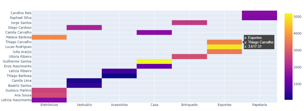
Voila! Here is our first Plotly heatmap.
Add title to Plotly heatmap
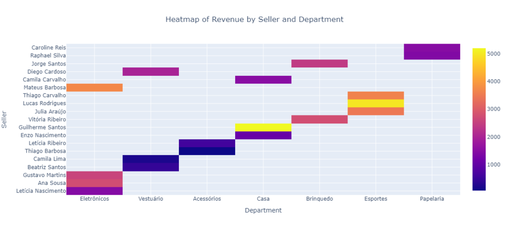
As you can see, we don’t have any title for our heatmap. Let’s add the title using the update_layout method.
fig.update_layout(
    title = 'Heatmap of Revenue by Seller and Department'
)

fig.show()

Title Alignment in Plotly heatmap
So, this is how easy it is to add a title to a chart in Plotly. Now let’s center align the title of our Plotly heatmap.
fig.update_layout(
    title='Heatmap of Revenue by Seller and Department',
    title_x = 0.5
)

fig.show()

Add axes titles to Plotly heatmap
We can use the update_xaxes and update_yaxes methods to add titles for the axes of the heatmap.
fig.update_xaxes(title = "Department")
fig.update_yaxes(title = "Seller")

fig.show()
Rotate axes labels of Plotly heatmap
In this dataset, we have only 7 departments. If there were more departments then displaying their labels on the horizontal axis would look messed up. In that case, rotating the labels can address this problem to a certain extent.
fig.update_xaxes(title = "Department", tickangle=-45)
fig.update_yaxes(title = "Seller")

fig.show()

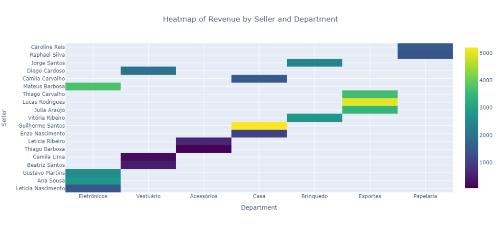
Change Plotly heatmap colorscale
To change the color palette of the Plotly heatmap, we can use the parameter colorscale in go.Heatmap() method. Here we will use the viridis palette. You can use other palettes as well.
fig = go.Figure(
    data = go.Heatmap(
        z = df["Revenue"],
        x = df["Department"],
        y = df["Seller"],
        colorscale = 'viridis' # color palette for heatmap
    )
)

fig.update_layout(
    title='Heatmap of Revenue by Seller and Department',
    title_x = 0.5
)

fig.update_xaxes(title = "Department")
fig.update_yaxes(title = "Seller")

fig.show()
Change Plotly heatmap grid color
You can change the color of the gridlines in the heatmap by using the update_xaxes and update_yaxes method in the layout of the figure.
fig = go.Figure(
    data = go.Heatmap(
        z = df["Revenue"],
        x = df["Department"],
        y = df["Seller"],
        colorscale = 'viridis'
    )
)

fig.update_layout(
    title='Heatmap of Revenue by Seller and Department',
    title_x = 0.5
)

fig.update_xaxes(title = "Department", gridcolor = "black")
fig.update_yaxes(title = "Seller", gridcolor = "black")

fig.show()

Change Plotly heatmap background color
To change the background color of the heatmap, you can use the `plot_bgcolor` attribute in the `update_layout` method.
fig = go.Figure(
    data = go.Heatmap(
        z = df["Revenue"],
        x = df["Department"],
        y = df["Seller"],
        colorscale = 'viridis'
    )
)

fig.update_layout(
    title='Heatmap of Revenue by Seller and Department',
    title_x = 0.5,
    plot_bgcolor = "orange"
)

fig.update_xaxes(title = "Department", gridcolor = "black")
fig.update_yaxes(title = "Seller", gridcolor = "black")

fig.show()

Modify Plotly heatmap hover text formatting
We can also modify the formatting of the tooltip text for the heatmap. We will add the hovertemplate parameter in the go.Heatmap() method.
fig = go.Figure(
    data = go.Heatmap(
        z = df["Revenue"],
        x = df["Department"],
        y = df["Seller"],
        colorscale = 'viridis',
        hovertemplate = "Seller: %{y}<br>Department: %{x}<br>Revenue: %{z}<extra></extra>"
    )
)

fig.update_layout(
    title='Heatmap of Revenue by Seller and Department',
    title_x = 0.5,
    plot_bgcolor = "orange"
)

fig.update_xaxes(title = "Department", gridcolor = "black")
fig.update_yaxes(title = "Seller", gridcolor = "black")

fig.show()

Change position of Plotly heatmap colorbar
To change the position of the colorbar from side to bottom in a Plotly heatmap, you can manually create a color scale and add a colorbar below the heatmap using layout.Coloraxis.
fig = go.Figure(
    data = go.Heatmap(
        z = df["Revenue"],
        x = df["Department"],
        y = df["Seller"],
        coloraxis = 'coloraxis',
        hovertemplate = "Seller: %{y}<br>Department: %{x}<br>Revenue: %{z}<extra></extra>"
    )
)

fig.update_layout(
    title='Heatmap of Revenue by Seller and Department',
    title_x = 0.5,
    plot_bgcolor = "orange",
    coloraxis = dict(colorscale='Viridis',
                     colorbar=dict(len=0.8,
                                   x=0.5,
                                   xanchor="center",
                                   y=-0.2,
                                   yanchor="top",
                                   orientation="h")
))

fig.update_xaxes(title = "Department", gridcolor = "black")
fig.update_yaxes(title = "Seller", gridcolor = "black")

fig.show()

Flip Plotly heatmap y-axis
To move the y-axis labels from the left to the right, the side attribute of the update_yaxes can be used. The value for side should be set to ‘right’.
fig = go.Figure(
    data = go.Heatmap(
        z = df["Revenue"],
        x = df["Department"],
        y = df["Seller"],
        coloraxis = 'coloraxis',
        hovertemplate = "Seller: %{y}<br>Department: %{x}<br>Revenue: %{z}<extra></extra>"
    )
)

fig.update_layout(
    title='Heatmap of Revenue by Seller and Department',
    title_x = 0.5,
    plot_bgcolor = "orange",
    coloraxis = dict(colorscale='Viridis',
                     colorbar=dict(len=0.8,
                                   x=0.5,
                                   xanchor="center",
                                   y=-0.2,
                                   yanchor="top",
                                   orientation="h")
))

fig.update_xaxes(title = "Department", gridcolor = "black")
fig.update_yaxes(title = "Seller", gridcolor = "black", side = "right")

fig.show()

Create Plotly heatmap correlation matrix
Heatmap can also be used to visualize the correlation between multiple numeric features. We can easily do that using Plotly as shown in the Python code below.
# Compute the correlation matrix
corr_matrix = df[['Revenue', 'Margin', 'Sales_Quantity']].corr()

# Creating the heatmap using plotly
fig = go.Figure(data=go.Heatmap(
                z=corr_matrix.values,
                x=corr_matrix.columns,
                y=corr_matrix.index))

# Customizing the heatmap layout
fig.update_layout(
    title="Correlation Heatmap"
)

# Display the heatmap
fig.show()

A correlation score closer to 1 means a high correlation. If the correlation is near about 0 then we can say that the correlation is weak.
Conclusion
I hope you have found this tutorial useful. I expect you to use Plotly heatmaps in your data analysis projects more often now and if you find any difficulty or need help then please drop a comment below.