Introduction
Visualizing complex datasets through interactive dashboards can make it a lot easier to uncover hidden patterns, trends, and relationships within the data. One powerful tool for creating such interactive visualizations is R Shiny, a web application framework for R that allows you to turn your data analyses into engaging and dynamic dashboards.
In this hands-on tutorial, we will walk you through the process of building an interactive dashboard to explore the California Housing Prices dataset using R Shiny. This dataset contains valuable information about housing characteristics, such as location, age, size, and median value, as well as demographic data like population and income.
Throughout this Shiny app dashboard tutorial, you will learn how to:
- Set up your R environment
- Load and preprocess the California Housing Prices dataset
- Design an intuitive user interface with customizable filters and controls
- Create various data visualizations using ggplot2, such as histograms and box plots
- Implement reactive server logic to update the dashboard based on user inputs
- Test and deploy your R Shiny dashboard
By the end of this tutorial, you will have a solid foundation in R Shiny development and be able to create your own interactive dashboards for a variety of datasets and use cases. In addition, you will be able to use this Shiny dashboard template with any other dataset as well and quickly generate a new Shiny dashboard.
About Dataset – California Housing Dataset
The dataset that we are going to use to build our Shiny dashboard app is the California Housing Dataset that contains information from the 1990 California census. The dataset has information related to demograhic of different regions in California, geo-positional data, income of the residents, prices of the housings and more.
Listed below are the columns of this dataset.
- longitude: A measure of how far west a house is; a higher value is farther west
- latitude: A measure of how far north a house is; a higher value is farther north
- housingMedianAge: Median age of a house within a block; a lower number is a newer building
- totalRooms: Total number of rooms within a block
- totalBedrooms: Total number of bedrooms within a block
- population: Total number of people residing within a block
- households: Total number of households, a group of people residing within a home unit, for a block
- medianIncome: Median income for households within a block of houses (measured in tens of thousands of US Dollars)
- medianHouseValue: Median house value for households within a block (measured in US Dollars)
- oceanProximity: Location of the house w.r.t ocean/sea
This dataset is a modified version of the California Housing dataset available from:
Luís Torgo’s page (University of Porto). This data was initially featured in the following paper: Pace, R. Kelley, and Ronald Barry. “Sparse spatial autoregressions.” Statistics & Probability Letters 33.3 (1997): 291-297.
Download the modified data 👉 Link
Setup and Prerequisites
Before getting started with your Shiny dashboard, kindly make sure that you have the following libraries installed:
a) shiny – An R package to build interactive web apps
b) shinythemes – Get several themes for your Shiny web app
b) dplyr – R package used for intuitive data manipulation
c) ggplot2 – Awesome visualization package
Import packages and load dataset
With the help of this R code you can easily import the packages and load the dataset from the CSV file.
# Load necessary libraries
library(shiny)
library(ggplot2)
library(dplyr)

# Read the housing.csv file
housing_data <- read.csv("housing.csv")
Data Preprocessing
There are some missing values in the column ‘totalBedrooms’. So, let’s fill these missing values with the average value of the same column.
# fill missing values
housing_data$totalBedrooms <- mean(housing_data$totalBedrooms, na.rm = T)
Download the entire R code and data 👉 Link
R Shiny Basics
Structure of a Shiny App: UI and Server Components
A Shiny app consists of two main components: the User Interface (UI) and the Server.
- User Interface (UI): The UI defines the layout and appearance of the app. It is responsible for organizing and presenting all the input controls, visualizations, and other elements that the user interacts with. Shiny provides a set of R functions to simplify this process, allowing you to create UI elements using only R.
- Server: The server is responsible for handling the Shiny app’s logic, processing user inputs, and generating outputs (such as plots or tables) based on the inputs. The server is written in R, and it uses a series of reactive expressions and observers to automatically update the outputs whenever the user interacts with the app. This reactivity makes Shiny apps dynamic and responsive, providing a seamless user experience.
Main Functions and Components Used in Shiny
Shiny provides a rich set of functions and components for building super cool web applications. Some of the most commonly used functions and components include:
- fluidPage: A function that creates a responsive, fluid layout for the app’s UI. The fluidPage automatically adjusts the size and position of the UI elements based on the user’s screen size.
- sidebarLayout: A function that creates a layout with a sidebar and a main panel. It is often used as a container for organizing the app’s input controls and visualizations.
- sidebarPanel: A function that creates a sidebar container, typically used for placing input controls, such as sliders, checkboxes, and dropdown menus.
- mainPanel: A function that creates a main panel container, typically used for displaying the app’s outputs, such as plots, tables, and text.
By combining these functions and components, you can create a wide variety of interactive web applications with Shiny, ranging from simple single-page dashboards to complex, multi-tabbed applications.
In addition to the functions and components mentioned above, Shiny also offers numerous other features that can enhance your app’s interactivity and functionality. These include:
- input functions: Functions such as
textInput,sliderInput,selectInput, andcheckboxInputallow you to create interactive input controls for collecting user inputs. - output functions: Functions such as
plotOutput,tableOutput,textOutput, andverbatimTextOutputallow you to display the app’s outputs, such as plots, tables, and text, in the main panel or other containers. - render functions: Functions such as
renderPlot,renderTable,renderText, andrenderUIare used in the server component to define how the app should generate and update its outputs based on the user inputs and other reactive elements. - update functions: Functions such as
updateTextInput,updateSliderInput,updateSelectInput, andupdateCheckboxInputallow you to programmatically update the values of input controls from within the server component, providing additional flexibility and control over the user interface.
With a solid grasp of Shiny’s core concepts and an understanding of other advanced features, you will be well-equipped to create sophisticated, interactive dashboards and applications that effectively visualize and communicate complex data insights.
Creating user interface of R Shiny app
We are going to use the sidebar-layout for our Shiny dashboard app. It has a sidepanel and a mainpanel. The sidepanel would contain the controls and filters for the dashboard, and the main panel would display the charts and tables.
Open a new R script file and name it as app.R as it is required if you want to deploy your Shiny app.
Let’s look at the R code for the UI part of the Shiny app.
# Define the user interface
ui <- fluidPage(
  # dark theme for Shiny app
  theme = shinythemes::shinytheme("darkly"),

  titlePanel("California Housing Prices Dashboard"),

  sidebarLayout(
    sidebarPanel(
      h3("Filters and Controls"),

      # filter 1
      selectInput(
        "ocean_proximity",
        "Select Ocean Proximity:",
        choices = c("All", unique(housing_data$oceanProximity)),
        selected = "All"
      ),

      # filter 2
      sliderInput(
        "age_range",
        "Housing Median Age Range:",
        min = min(housing_data$housingMedianAge),
        max = max(housing_data$housingMedianAge),
        value = c(min(housing_data$housingMedianAge), max(housing_data$housingMedianAge))
      ),

      # filter 3
      sliderInput(
        "income_range",
        "Median Income Range:",
        min = min(housing_data$medianIncome),
        max = max(housing_data$medianIncome),
        value = c(min(housing_data$medianIncome), max(housing_data$medianIncome)),
        step = 0.1
      )
    ),
    mainPanel(
      tabsetPanel(
        # first tab
        tabPanel("Histograms",
                 plotOutput("hist_house_value"),
                 plotOutput("hist_income"),
                 plotOutput("hist_age")),

        # second tab
        tabPanel("Box Plots",
                 plotOutput("box_plot_house_value"),
                 plotOutput("box_plot_income")),

        # third tab
        tabPanel("Summary",
                 verbatimTextOutput("summary_text"))
      )
    )
  )
)
In this code, we are using the fluidPage element to keep our dashboard responsive so that it gets rendered on any screen size properly. Then we have selected the “darkly” theme for our shiny app.
The next element is the titlePanel, in this we can specify the title of our Shiny app.
After that we use the sidebarLayout in which we define different elements of the sidepanel and the main panel. The sidepanel mostly contains the input functions like dropdown selection, sliders etc. The mainpanel contains the output functions to mainly display the plots.
Sidepanel Items
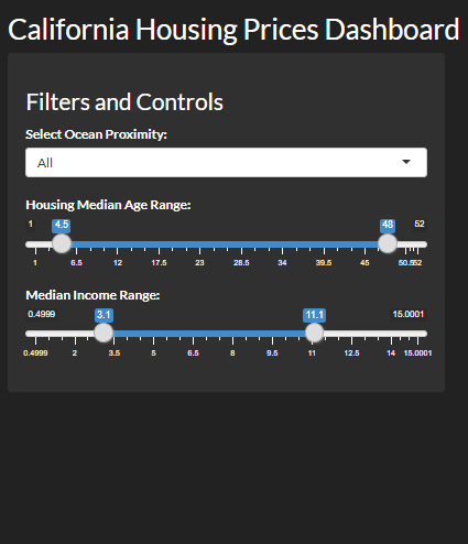
We have included three filters in the sidepanel of our R Shiny web app.
- The first filter is to select the proximity of the house from the ocean by using the selectInput function.
- The second filter is a double slider that can be used to filter data based on the median housing age.
- The third filter is also a double slider that can be used to filter data based on the median income.
Mainpanel Items
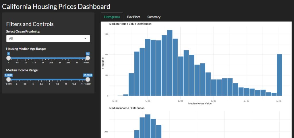
We are going to have three tabs in the mainpanel. Each tab contains the placeholders that will display the charts and we will define this placeholder structure in the UI component.
- The first tab will visualize variables like median house value, median income, and housing median age with the help of histograms.
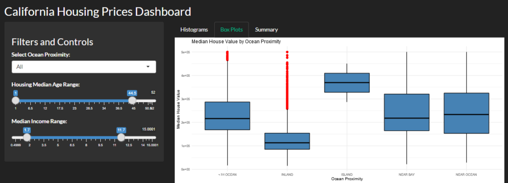
- The second tab will visualize the distribution of the above three metrics with respect to oceanProximity.
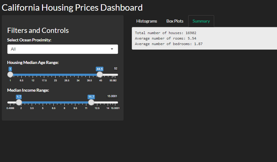
- The third tab will render a basic summary of number of houses, average number of rooms and bedrooms.
The final design of the sidepanel will look as shown below:
Creating server logic of R Shiny app
Now after creating the structure of the UI for our R Shiny dashboard app. We will now create the server function in which we will connect the data with the filters defined in the UI and also define the charts and the summary for all the three tabs of the web app.
# Define the server logic
server <- function(input, output, session) {
  filtered_data <- reactive({
    data <- housing_data

    if (input$ocean_proximity != "All") {
      data <- data[data$oceanProximity == input$ocean_proximity,]
    }

    data <- data[data$housingMedianAge >= input$age_range[1] &
                   data$housingMedianAge <= input$age_range[2],]

    data <- data[data$medianIncome >= input$income_range[1] &
                   data$medianIncome <= input$income_range[2],]

    data
  })

  output$hist_house_value <- renderPlot({
    ggplot(filtered_data(), aes(medianHouseValue)) +
      geom_histogram(fill = "steelblue", color = "white") +
      theme_minimal() +
      labs(title = "Median House Value Distribution", x = "Median House Value", y = "Frequency")
  })

  output$hist_income <- renderPlot({
    ggplot(filtered_data(), aes(medianIncome)) +
      geom_histogram(fill = "steelblue", color = "white") +
      theme_minimal() +
      labs(title = "Median Income Distribution", x = "Median Income", y = "Frequency")
  })

  output$hist_age <- renderPlot({
    ggplot(filtered_data(), aes(housingMedianAge)) +
      geom_histogram(fill = "steelblue", color = "white") +
      theme_minimal() +
      labs(title = "Housing Median Age Distribution", x = "Housing Median Age", y = "Frequency")
  })

  output$box_plot_house_value <- renderPlot({
    ggplot(filtered_data(), aes(x = oceanProximity, y = medianHouseValue)) +
      geom_boxplot(fill = "steelblue", color = "black", outlier.colour="red") +
      theme_minimal() +
      labs(title = "Median House Value by Ocean Proximity", x = "Ocean Proximity", y = "Median House Value")
  })

  output$box_plot_income <- renderPlot({
    ggplot(filtered_data(), aes(x = oceanProximity, y = medianIncome)) +
      geom_boxplot(fill = "steelblue", color = "black", outlier.colour="red") +
      theme_minimal() +
      labs(title = "Median Income by Ocean Proximity", x = "Ocean Proximity", y = "Median Income")
  })

  output$summary_text <- renderText({
    data <- filtered_data()
    total_houses <- nrow(data)
    avg_rooms <- mean(data$totalRooms / data$households)
    avg_bedrooms <- mean(data$totalBedrooms / data$households)

    sprintf("Total number of houses: %d\nAverage number of rooms: %.2f\nAverage number of bedrooms: %.2f",
            total_houses, avg_rooms, avg_bedrooms)
  })
}
To generate the charts and visualizations, we can use the renderPlot function and to render text such as data summary, we can use the renderText function. Finally to run the R Shiny app locally, add the below R code to your R script and run the entire code.
# Execute the Shiny app
shinyApp(ui, server)
Download the entire R code and data 👉 Link
The Shiny app will open in your default web browser. Following are the some snapshots of the final Shiny dashboard.
Deploy R Shiny Dashboard
Shinyapps.io is a popular hosting platform for Shiny apps, provided by RStudio. It offers a free tier that allows you to deploy and share your Shiny apps with others easily. To deploy your Shiny app on Shinyapps.io for free, follow these simple steps:
1. Go to shinyapps.io, create your account and sign in.
2. Install the rsconnect package in your RStudio. Use the code install.packages(‘rsconnect’) in the console.
3. Go to the dashboard, under Authorize Account section copy the code and paste-run it in the RStudio console to authorize your account on shinyapps.io.
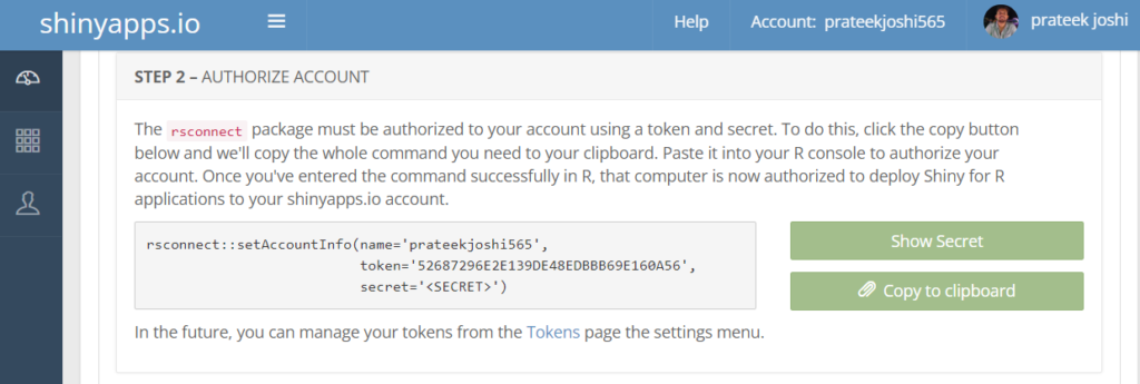
4. In the next app run the command deployApp() in the console. Make sure the name of the R script file name is app.R then your Shiny app will be deployed to shinyapps.io automatically.
With these steps, you can quickly and easily deploy your Shiny app on Shinyapps.io for free. Remember that the free tier has some limitations in terms of the number of apps and active hours per month, so you may need to upgrade to a paid plan if your app requires more resources